How to Create Good Charts
Data visualisations is really useful. I don’t need to tell you why.
There are so many terrible charts out there though - in academia, in the development sector, in corporate. There are entire websites dedicated to collecting hilarious examples of bad charts.
When trying to make evidence-based decision-making happen, we can follow a few rules of thumb to ensure that we are safe on the charts front.
What is a Good Chart?
A good chart is simple.
A good chart:
- Does not look cluttered
- Has easily readable text
- Can be understood with little effort
That’s it. That’s the rule of thumb. Just keep repeating these three points over and over in your head when you create a chart the next time.
In most cases, this can be achieved by restricting yourself to pie, line or bar charts. (Definitely not the 3D kind)
In the context of evidence-based decision-making, if your chart requires a “how to read this” explanation, it’s not a good chart.
How Do You Create a Good Chart?
To make a good chart:
- Use the right type of chart
- Provide a title, legend and labels
- Use fonts, color and contrast effectively
- Label the axes and data points clearly
- Use the appropriate scale for the axis
I provide examples for a good pie chart, line chart, and bar chart below.
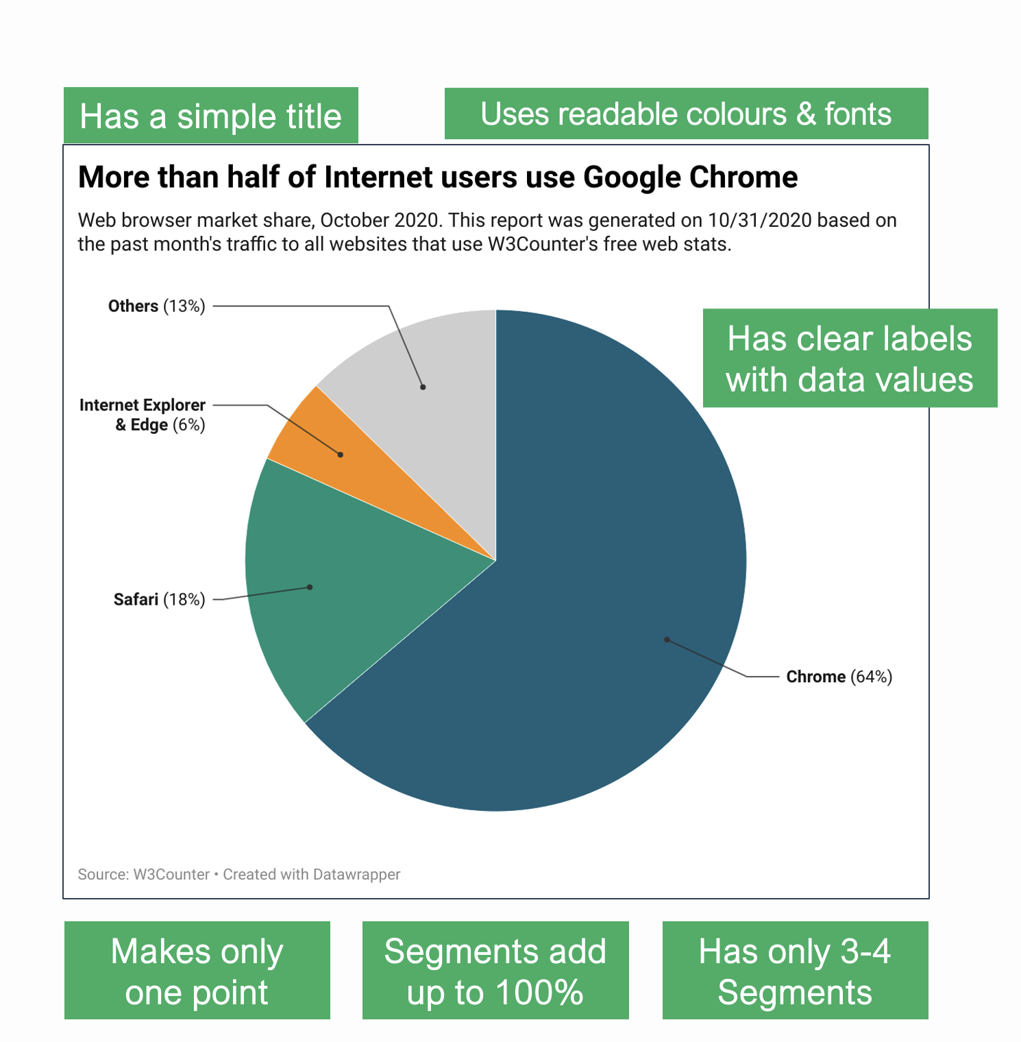
A Good Pie Chart
A Pie Chart divides a circle into segments.
- All segments must add up to 100%
- Comparing segments gives only an approximate idea
- Using more than 3-4 segments can make the chart difficult to read
- Using a 3D chart can change the perception of its size
- In most cases, it is best to use a bar chart instead
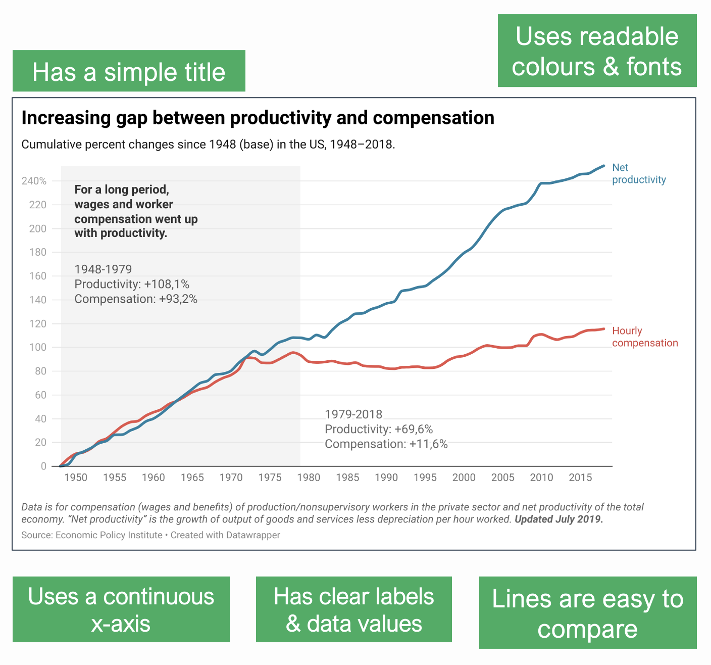
A Good Line Chart
A Line Chart shows data against a continuous axis (usually time).
- X-axis should be continuous
- It can be used to compare multiple lines
- Too many lines make it difficult to read the chart
- Changing the scale of Y-axis can change the meaning of the chart
Instead of a line chart, a scatterplot or a bar chart can be used as well.
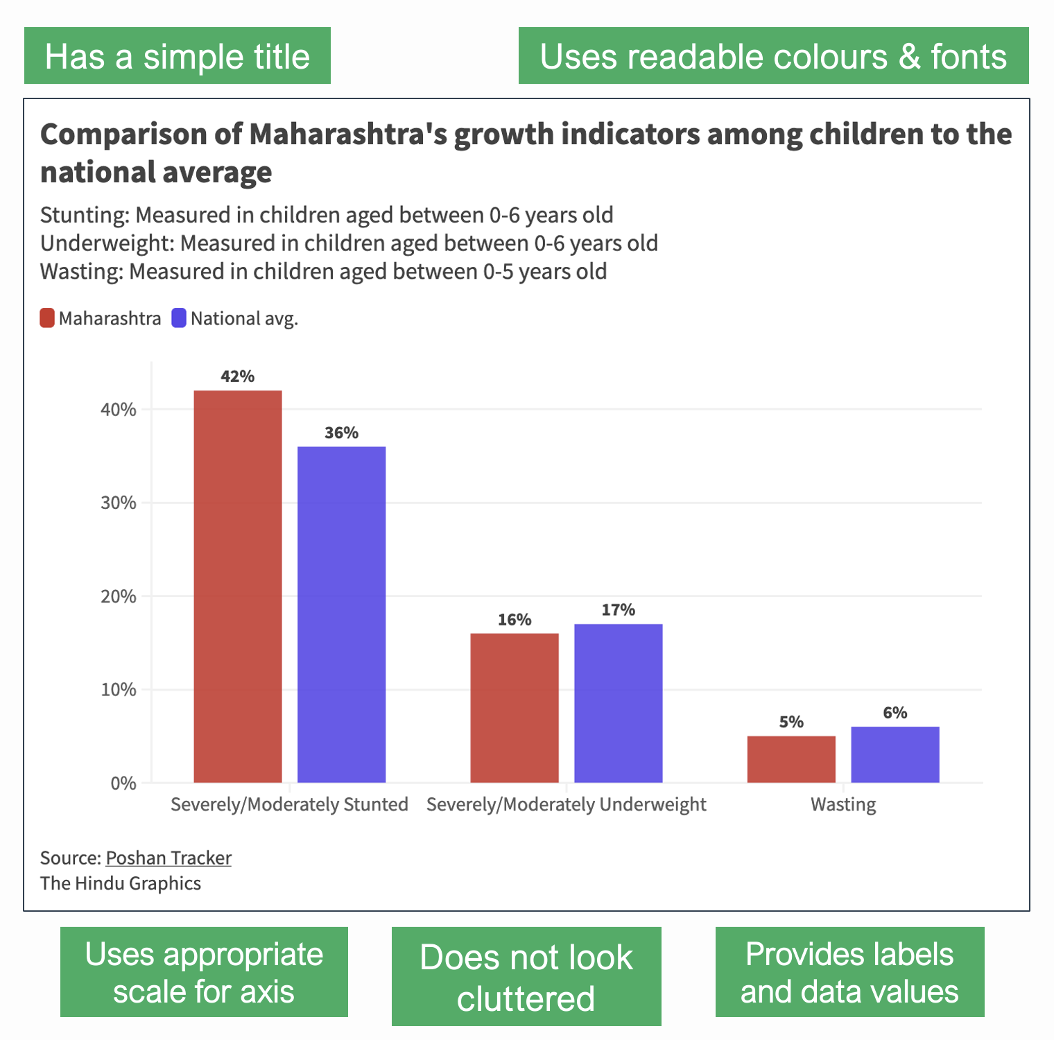
A Good Bar Chart
A Bar Chart compares discrete values across categories.
- X-axis shows categories; Y-axis shows values
- It can be used to compare multiple categories
- Values of bars should be clearly mentioned
- Changing the scale of Y-axis can change the meaning of the chart
If there are less than four bars, a pie chart or a stacked bar chart may be used, so long as the percentages add up to a 100.
BONUS: ONE HACK TO INSTANTLY MAKE GOOD CHARTS
Use Datawrapper.1
Just use it. It’ll save you from 9 out of 10 sins of bad data vis automatically.
Another hack: Show your chart to a colleague or friend and ask them - “Hey, what do you think this chart means?”
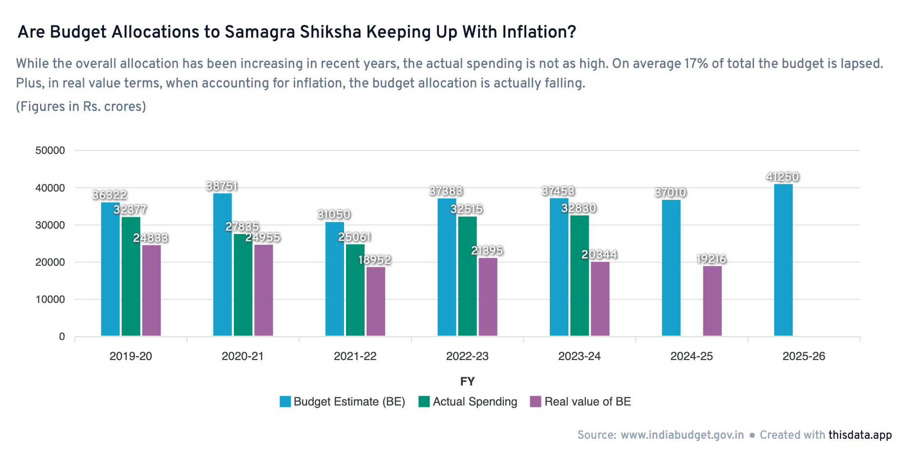
So, go on, make good charts. Make a great chart even. Something that you are proud of, like this one that I quite like –
Again, this page is opinions, not gospel. Use your better judgement.
Relevant:
- Friends Don’t Let Friends Make Bad Graphs
- The Data Visualisation Catalogue
- Data Vis Do’s and Don’ts by Datawrapper
- Improving the readability of a line chart by Yan Holtz (Tutorial)
- How to Spot Visualization Lies by Flowing Data
- Fundamentals of Data Visualization by Claus O. Wilke (E-Book)
- Saloni’s guide to data visualization
-
Not sponsored. ↩︎