“The Number Went Up” Is Not Analysis - Do Better Than a Bot
As analysts, we often fall back on statements that sound careful, objective, and safe:
“The indicator increased in the latest period.”
“There was an improvement compared to the previous year.”
“The trend shows a gradual rise.”
These sentences are technically correct.
They are quite useless.
If your analysis stops at “the number went up”, you are not doing analysis. You are doing reporting, and even that, a spreadsheet or a bot can do better and faster. If your entire analysis could be replaced by an automated chart caption, or a generic summary like “increased compared to last year” then the value you are adding is minimal.
Without interpretation, numbers remain inert. I would go so far to say that mere neutrality is not objectivity, it is abdication of responsibility.
Decision-makers ask for analysis because they need help answering questions like:
- Is this good or bad?
- Is this on track?
- Should we be concerned?
- What changed, and why?
- What should we do next?
A sentence like “the number went up” answers none of these.
How to Interpert
Instead of just reporting the change, learn to situate the change in context.
Consider this –
“The number went up when we expected it to go down, which suggests that the intervention may not be having the intended effect. We may need to revisit our assumptions or implementation strategy.”
I know this is still a vague thing to say but nonetheless this kind of statement attempts to connect data to expectations, signal whether something is off-track, and create a basis for discussion and decision.
Data does not speak. People speak about data.
Narrating what the data shows is the starting point, not the endpoint. A chart already tells the reader whether a line goes up or down. Repeating that information in prose adds little value unless you go further and explain:
- Why this change matters
- Whether it was expected or surprising
- What it suggests about underlying processes
- What someone should do differently because of it
So the next time someone says “let the data speak”, you tell them!
Taking responsibility does not mean overclaiming
Interpreting data does not mean making grand claims or pretending to know more than you do.
Good interpretation acknowledges uncertainty, flags data limitations, distinguishes signal from noise, states assumptions clearly, but still takes a position.
There is a difference between:
“The data is inconclusive.”
and
“Given the small sample size and reporting delays, this increase should be interpreted cautiously. However, if sustained, it may indicate…”
One shuts down thinking. The other enables it.
Write for decisions, not for deniability
Your advantage over a bot is context. You are in the trenches with access to the historical and emotional context of decisions and actions. You haven’t just read about gravity1 you experience it every day.
Use that to your advantage.
If your language is designed primarily to protect yourself from being wrong, it will rarely help anyone else be right.
A good test to apply to any analytical sentence is: “If I were a decision-maker, would this help me decide what to do next?”
If the answer is no, revise.
You do not need more sophisticated models to improve your analysis. You need clearer thinking and more ownership of interpretation.
So the next time you are tempted to write: “The number went up.”
Pause and ask:
- Compared to what?
- Relative to expectations?
- Why might this have happened?
- What does this imply?
- What should someone consider doing differently?
That is where analysis begins.
Or you know, hire us! We’ll help you.
BONUS: The one case where you can get away with just “number go up”
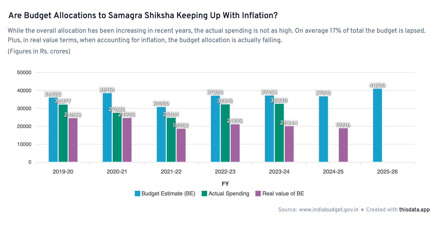
When your analysis itself is novel, you can get away with simple reporting. In this chart above, a bad example of reporting would’ve been to say: “The Samagra Shiksha budget allocation has increased from previous year.” But by comparing it across multiple years and using the “real value” (inflation-adjusted), the chart shows a contrary picture – which in itself is novel.
-
Gravity implies knowing what was supposed to happen, being aware of implementation realities, and recognising which changes matter and which do not ↩︎